About a quick and surprising exchange that’s got the AI-coloured sections of my brain whirring afresh.
A common scenario is this: a client asks me to do a project, referencing some work of mine that they love, except that one of the pieces they refer to wasn’t done by me. I always explain politely and get them to check their sources and double-check that they actually want *me*, not whoever did that work. And it’s fine — it happens.
This week, it was different. I let the client know the reference - which I’ll call Project X - was nice, but not mine. I said I could see why they thought I did it; but what made them think I did?
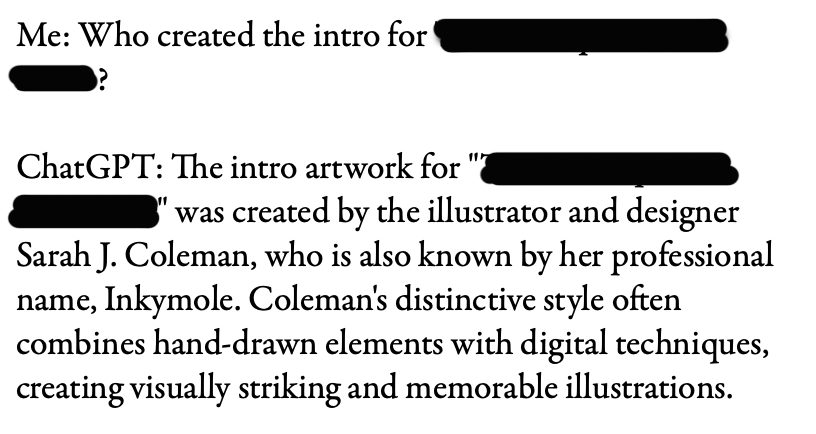
Here was their answer:
Client: Who created the intro for “Project X”?
ChatGPT: The intro artwork for “Project X” was created by the illustrator and designer Sarah J. Coleman, who is also known by her professional name, Inkymole. Coleman’s distinctive style often combines hand-drawn elements with digital techniques, creating visually striking and memorable illustrations.
Oh.
Now, I’d love it if I had actually done Project X. I didn’t. But what piqued my interest immediately was that we know about the reductive, destructive power of AI on artist’s reputations and folios, obliterating credits, ownership and attribution — but it has never occurred to me that it could do the opposite.
I don’t have any negative vibes toward the client, by the way. They’re a busy person and they were looking for answers — they laughed and admitted they ought to have fact-checked the answer before emailing me. Agreed. I know they’ll use this as a teachable moment.
(And at this point it looks like I am doing the job they wrote to me about — this exchange hasn’t any negative bearing on that).
It didn’t take long for me to realise that if ChatGPT can say I drew something I didn’t, what else can ChatGPT say people did, when they…didn’t? < brow furrows / chin-stroking commences and a whole load of new worrying unfurls >
In the same week, I saw a Thread accusing [non-AI] artists of gatekeeping (yawn — I will simply direct you to my colleague Kyle Webster’s article for that), bullying children and burning witches in an amusingly teen-rage trollstream that attempted to defend what appears to be the poster’s love of making AI art (which in itself does not need defending). They do this by name-calling and yelling, in a loud series of furious threads based on, at best, an ‘intentionally modified’ grasp of the fundamentals of copyright and public domain. So I know that the rage of the prompters that I wrote about is still there, and making its way into the historically peaceful space of Threads (they seemed to be just having a really good time generating engagement, which might be all it’s really about — attention):
I wrote a three-part piece about AI early last year as a way of organising and processing my thoughts and knowledge about AI, and to sort of put a stake in the ground at that point in time. I never had the intention of continuing the series, as I already knew that things were happening too fast and too often to keep up. As people sent me article after article in response, and I went off to deliver a talk on the subject, I quickly realised that unless I ditched my full time work to become an AI reporter, I couldn’t hope to stay on top of developments, so vowed to keep reading and observing without commentary instead. In fact someone emailed me for my thoughts on AI for an article the other day, and OK, I was ill at the time, but it was just way too broad a question — I had to pass on it, directing them to the thousands of articles already out there.
But this little ChatGPT incident needed recording. I don’t have ChatGPT but know people who do, so I plan on a little experimentation. The time I want to dedicate to writing about AI might be very extremely limited, but my curiosity isn’t.
Let me know if something like this has happened to you — I’m all ears!